Case Study 03/04

Varanasi Smart City.

Multiple city-level monitoring and management systems, each a complete operational world of its own, unified into one operating model any trained operator could run from one room: in production for over 7 years, never replaced.

Business challenge
Unify 7 major city systems into one command centre that minimally trained government operators could run under pressure.
My authority
Owned the UX across every module: set the architecture, designed the systems, held it consistent through delivery.
Scale
A city of millions: 7 major systems, 1 command centre, 2,500+ cameras, 10,000 lights, 24/7.
Outcome
7+ years in production, never replaced, and the template for Dholera, the company's next smart city.
More context Collapse context
My role UI/UX Designer → Senior UI/UX Designer, owning system logic through production screens, SOP design, and client interaction.
Team My UX function, a graphic designer and front-end developer I hired in, with the development, QA, and delivery teams in a parallel pipeline.
Stakeholders The Varanasi Smart City client team, the SI partner, Intellve leadership, and the delivery teams.
Duration About 10 to 12 months to design and deliver, then a year of iterations, fixes, and additions, still maintained today.
The program A national Smart City Mission programme valued in the hundreds of crores, Intellve delivering the software platform.
What carried forward The dual-view architecture, SOP workflows, and cross-module integration, foundational to Dholera and every build after.
Overview

A city, designed to be operable.

How systems designed to think before the operator sees the screen let a city's own people run all of its operations from a single platform.

The Kashi Integrated Command and Control Centre runs Varanasi, a city of millions and one of the oldest living cities on earth, from a single room: 25 operator desks, a 10.8 by 2.6 metre video wall, 24/7. From here the city's own teams run surveillance, traffic, street lighting, waste collection, environmental monitoring, public displays, and announcements, with cameras, signals, lights, sensors, bins, and speakers integrated to talk to each other and act on each other, not sit side by side.

I owned the UX across every system and set the direction every module was built on, before most screens existed. The design problem was never the screens; it was everything before them. Thousands of devices stream raw, messy, disorganised data no human can act on, so the system was designed to do the thinking first: predefined rules, thresholds, and logic turn that stream into clear, severity-classified, decision-ready information, step-by-step SOPs carry the operator through the response, and a multi-level escalation matrix makes sure nothing critical waits on any one person. The operator's job is the decision; the system's job is everything before and around it. Delivered by early 2019, inaugurated by the Prime Minister that February, and running continuously since.

Systems signal
The intelligence sits in the system, not the operator's memory: rules classify, SOPs guide, and one UI, UX, and architecture holds across every module, so moving between systems mid-incident costs nothing. Design the thinking into the system, and minimally trained people can run a city.
Leadership signal
I carried the UX of the programme while building the function under it: I made the case for and hired a graphic designer at the start and a front-end developer mid-project, growing the design capability while the delivery pipeline ran. The programme shipped, and the company kept the team it built.
Executive Summary
I set the architecture every module was built on: the system does the thinking, rules and SOPs turn raw city data into guided decisions, one layer across every system. In production for over 7 years.
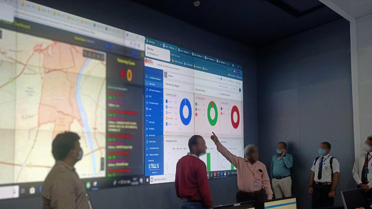
The Kashi Integrated Command and Control Centre in operation, the Intellve platform on the video wall
Built for the city to run itself

The platform in everyday use: the city's own operators on a live map and consolidated alerts, with no vendor in the room. That was the design goal.

The problem

Operable, or nothing.

Surveillance, traffic, lighting, waste, environment, displays, and announcements, each a complete system of its own, to be run from one command centre, around the clock, with millions of people depending on it.

One operating model, or chaos.

Varanasi Smart City Limited needed one platform that could integrate and run an entire city's operations from a single command centre. Each system was a complete operational world of its own, with its own devices, alert types, operator workflows, standard procedures, and analytics. The challenge was never building good systems one by one; it was making 7 major systems feel like one, operable under pressure by government personnel with minimal technical training.

A national mandate.

This was a national Smart City Mission programme for Varanasi, valued in the hundreds of crores, with Intellve delivering the software and the operator platform across the city's systems. The mandate was explicit: unify the city's operations into one Integrated Command and Control Centre. The platform that could actually do it did not exist yet.

Executive Summary
A city of millions, run from one platform, across 7 major systems each with its own devices and workflows. The task was never good products one by one; it was one operating model they could all share.

7 major systems ran the city's daily operations from the command centre, each a complete operational world of its own. The 8th faced the other way: the citizen app, the city's direct line in. A help desk, COVID-19 management, and the analytics dashboard ran alongside.

Module 01

Surveillance

City-wide CCTV across ghats, markets, junctions, and strategic points, feeding live and recorded video into the command centre.

2,500+ cameras, 720+ locations
Module 02

ITMS

Signal control, automatic number-plate recognition, e-challan violation tickets, and priority green corridors for VIP convoys and emergency vehicles.

ANPR + e-challan + priority routing
Module 03

Solid Waste

GPS-tracked collection vehicles on geo-fenced routes, smart-bin fill monitoring, route compliance, and engine-off tracking for fuel efficiency.

43–45 tracked vehicles
Module 04

Environmental

Live air quality, temperature, humidity, and pollution telemetry from stations across the city, feeding automated public displays.

15 monitoring stations
Module 05

Smart Lighting

Adaptive LED street lighting with remote intensity control, fault detection, and energy telemetry across every ward.

10,000 LEDs, 27 wards
Module 06

Variable Message Displays

Electronic boards pushing public advisories, traffic and safety alerts, and civic messaging across the city.

live public advisories
Module 07

Public Address

Networked speakers at ghats, markets, and public squares for emergency announcements and zoned civic broadcasts.

zoned citywide broadcast
Module 08

Citizen App

The system facing the other way: residents reach the centre directly, raising complaints with no login, in Hindi or English, by text or voice.

zero-login complaint to resolution
The research

Understand, then design.

The tender defined what to build. Understanding who would run it, and how they actually behave, defined how.

Each module began the same way: the tender document, client discussions, and domain research per system, studied until the operational logic was clear, what events trigger what alerts, what an operator must see, what actions follow, and how the modules connect. The devices and their SDKs existed; what had never existed was all of them integrated in one layer, tailored to run a city, so there was nothing to copy and the logic had to be designed before the screens. Prior deployments had already taught the defining constraint: command-centre operators, and government operators most of all, work under pressure with minimal technical training, so whatever the design asked of them had to be learnable once and transferable everywhere.

Readings of human behaviour, anchored in UX law and cognitive psychology, shaped the hardest calls before a screen was drawn. Citizens most likely to open a complaint app are in an emergency or real frustration, exactly when patience for a registration form is lowest, so it would ask for nothing to get started. A workforce handed an ambiguous instruction finds workarounds, so a waste model that told drivers to collect only when a sensor alerted would fail on incentives, not on technology. And an operator who can turn a live traffic signal green carries a real fear of the irreversible: a wrong change can cause an accident, so the design would have to show consequences before actions. Behaviour was an input to the design, not a lesson drawn afterward.

Psychology signal
The platform's users were operators under pressure and citizens across every level of literacy and language. Designing for the moment of maximum frustration and minimum patience, not the ideal calm user, is what made it usable by the people who actually had to use it.
Executive Summary
Tender, client, and domain study per module, plus firm readings of behaviour: design for the operator's transferable mental model, for the citizen's worst moment, and for the fear of irreversible action.
The solution

The system thinks. The operator decides.

The intelligence behind the screens, the one structure in front of them, and the design calls that show how the platform was reasoned.

Table and map, always.

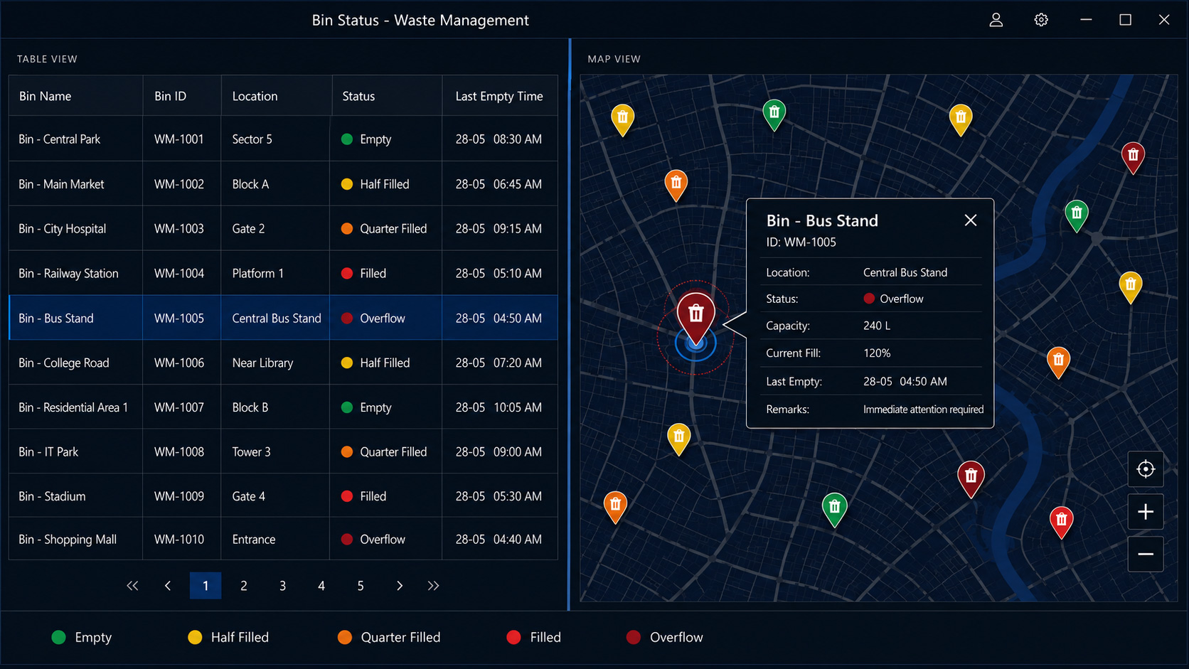
Before any individual module was designed, I made one decision that governed all of them: every module would use exactly the same two-view structure. A table view, detailed data with filters, search, and sortable columns, every device listed and every status visible. And a map view, the same data in spatial context with colour-coded pins, where in the city the problem is and which areas need attention. The data changed, the devices changed, the icons changed; the structure never did, a deliberate use of consistency and recognition-over-recall, the principles that decide whether an interface holds under pressure.

It was a deliberate architectural decision driven by how the room actually works. Operators are not assigned one system each: the systems act on each other, an incident pulls an operator across two or three of them mid-response, and a surveillance alert can end in a PA announcement or a signal change. Every change of interface, logic, or layout in that chain adds cognitive load at the exact moment a slow or wrong decision costs most. One structure everywhere removed that cost, and behind it the platform carried the rest: predefined rules and thresholds turning thousands of devices' raw data into severity-classified, decision-ready alerts, and step-by-step SOPs, specific to each module, alert type, and severity, guiding the response so the knowledge lived in the interface rather than the operator's memory.

Executive Summary
Rules and SOPs do the thinking behind the screens; one pattern, table and map, holds in front of them, so operators move across systems mid-incident without friction. What made a city-scale platform safe to run under pressure.
A recreation of the operator interface, split into the table view and the map view of the solid waste module: a searchable bin status table on the left, the same bins on a live city map on the right, with one overflowing bin selected in both.
Two views, every module

Each module monitored something different, with its own devices and alerts. The judgment was to refuse a bespoke design for any of them and give every one the same two views: a searchable table for detail, the same data on a live map for context. The system behind the screen changed; the way an operator read it never did.

The city as one system.

Running the city's systems in one room keeps them separate systems. Making them share devices, alerts, and actions is what turns them into one city intelligence platform. That integration was not in the tender; it was scope I saw, argued for, and won the responsibility to define. I designed it, because a command centre is where city operations are coordinated, not where systems report their status.

Every alert, from any module, opens in one panel: the details, the relevant camera feeds, and quick-action buttons for the systems it touches, with nothing to navigate away to.

A crowd-gathering alert from surveillance opens the camera feed, a public-address broadcast button, and the local environmental readings, in one window, mid-incident.

Surveillance cameras link to street-light locations to verify a reported failure; environmental readings feed the public display boards; a traffic-congestion alert pushes a warning to the boards upstream of the affected junction. An incident in a city does not stay inside one system's boundary, so the operator's response was designed not to either.

The one-junction traffic challenge.

The ITMS requirement was specific: when a camera flags congestion at a junction, show the operator that junction's feed. Reviewing it myself, the way I work through anything I design, one question kept surfacing: what happens after the operator sees the jam and turns the signal green? If the next junction is already backed up, turning this one green clears nothing; it pushes the congestion one junction forward.

So a single junction's feed was the wrong unit. The fix was a corridor view: when an alert opens, the system shows 5 junctions in context automatically, the triggered one, 2 ahead, 2 behind, so the operator sees the consequence of an action before taking it. Parallel and intersecting roads stay one click away on the map but do not auto-open: enough context to make a system-level decision, not so much that the decision gets harder. For VIP convoys and emergency vehicles, the same corridor follows the pre-configured route.
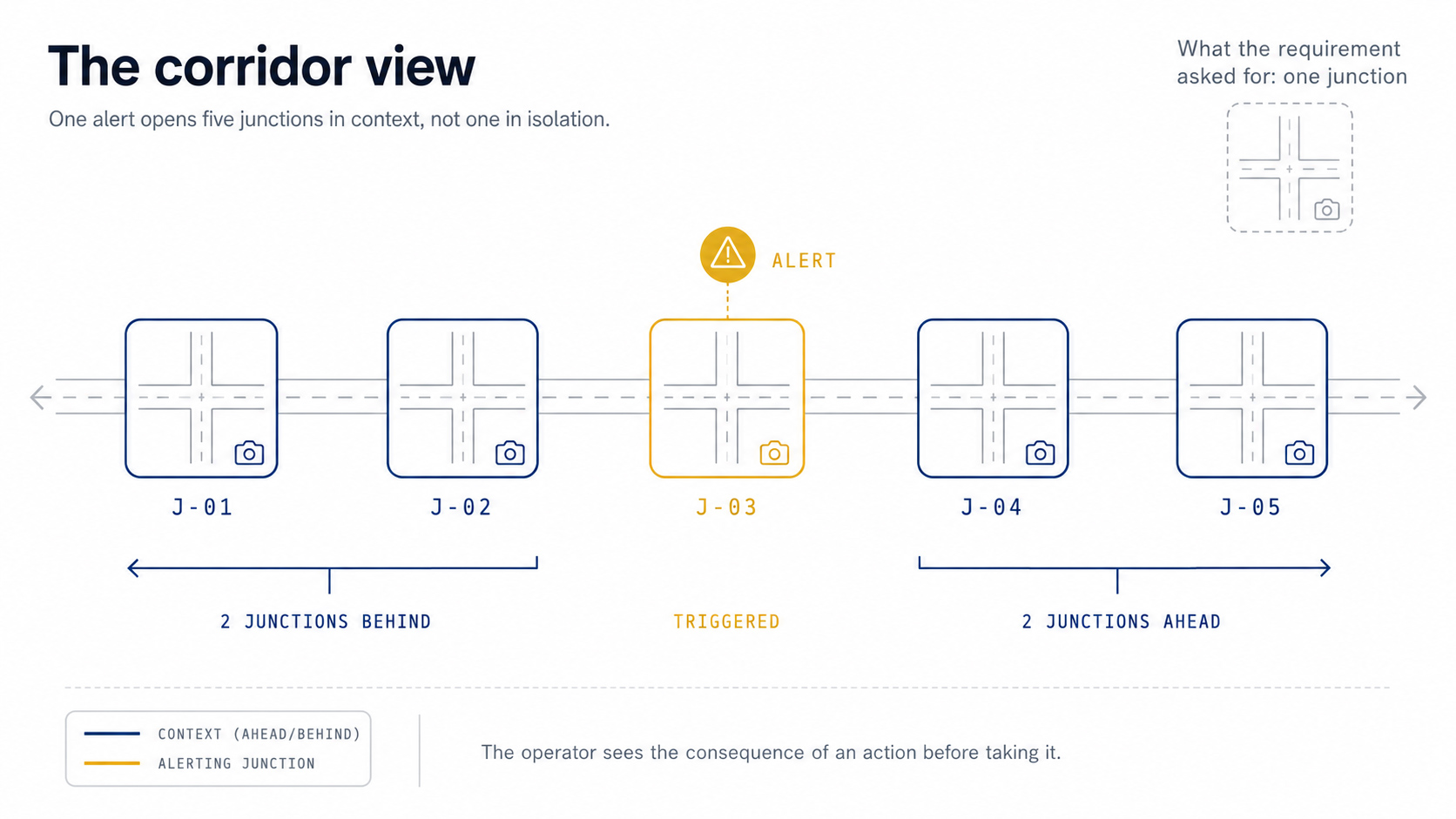
The corridor view: one alert opens five junctions in context, the triggered junction plus two ahead and two behind
Five, not every camera

Every nearby camera could have opened on the alert. Showing them all would have buried the operator. Choosing exactly 5, the triggered junction and 2 each side, was the design judgment: enough to see the whole corridor, little enough to still decide.
Waste collection sensor problem.

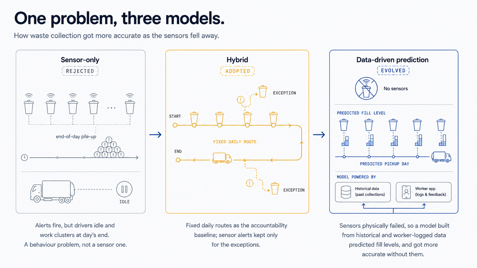
The original plan was fully sensor-driven: fill-level sensors on every bin, each triggering a dispatch alert. The technology worked; the behaviour it assumed did not. Sensor-only dispatch would have left drivers idling until an alert came, clustered hundreds of alerts at the end of the day as crews went home, and left no one a fixed route to answer for. No interface fixes that. It is a workforce-incentive problem, not a screen problem.

In discussions with the Smart City authorities I argued exactly that, and proposed a hybrid: fixed daily routes as the accountability baseline, with sensor alerts kept for the exceptions. Then the real world intervened again: bin sensors began failing from public-infrastructure wear, and replacement was the obvious proposal. I pitched a structural alternative instead: historical sensor data combined with the fill-level records crews already entered through the Field Responder app, feeding a prediction model per bin that grew more accurate with every entry. The city ran both in parallel, the hybrid model where sensors still worked, the data-driven model where they had failed, while the administration kept repairing hardware. The system became more accurate without depending on the sensors it started with.

Systems thinking signal
The sensor failure that forced a rethink was turned into a better model. Constraints imposed by the real world produced a more durable solution than the original sensor-dependent design. The system that started with sensors became more accurate without them.
Waste collection in three models: sensor-only rejected, hybrid of fixed routes plus exception alerts adopted, and data-driven prediction after the sensors failed
The workers became the sensors

When the hardware failed, the fill-level logs crews already entered through the field app, with the historical record, fed the prediction model. The data the work produced replaced the sensors it was meant to capture.

Citizen's app no login, by design.

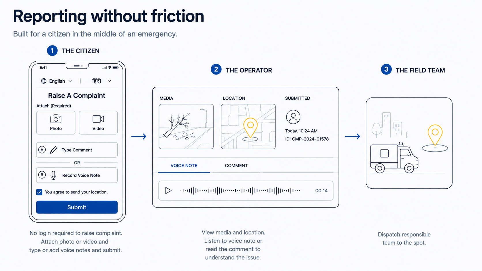
Residents needed a direct line to the command centre for civic emergencies: burst water pipes, flooding, garbage overflow, road damage. The most consequential decision for the citizen app was one of the first: no login, no registration, no account to raise a complaint. The people most likely to open it are in the middle of something going wrong, the exact moment when patience for forms and passwords is lowest.

So the flow is built for someone who may not type well, may not read easily, or simply has no time. Enter a mobile number, attach a photo or video of the problem, then either type a short note with the location or just record a voice note and send. Voice was expected to be the primary method for a large share of residents, not a fallback, and both Hindi and English were supported from launch.

The app passes the phone's location to the operator automatically, so even when a citizen types nothing at all, the operator can place the spot from the location and the attached media and dispatch a team that finds it without a follow-up call. Checking back is just as light: open complaint status, enter the same number, verify by OTP, and see every complaint from that number with where it stands.

The citizen complaint flow: no login, attach photo or video, type a note or record a voice note, location sent automatically to the operator who dispatches a field team
Voice, not as a fallback

For a resident who cannot type easily, or has no time, a voice note replaces the form entirely. It was planned as the primary way a large share of people would report, not an accessibility extra bolted on.

Escalation, so nothing critical waits.

A critical alert that sits unattended is a failure the interface alone cannot prevent, so the platform carried a multi-level escalation matrix I helped architect with the respective teams. An alert not attended or not closed within its defined time escalates: to the supervisor, then the manager, then the relevant department, level by level up to the highest authority, by alert, SMS, and email, while unattended work reassigns to another operator until someone owns it. In parallel, the system dispatched directly: a fire alert sent location and details to the nearest fire station automatically, an accident reported through the citizen app alerted the nearest hospital and emergency services, and the critical departments held operator seats at the centre, receiving exactly the severities their TouchConfig roles assigned them.

Systems signal
The design assumed the operator could fail, and made the system responsible for the consequence. In critical infrastructure, the safety net is part of the design, not an exception path.

What made scale work.

01
Three-colour device status, across every module
Green, working. Grey, expected off, a street light in daylight. Red, should be working and is not. The grey state was the critical one: without it, genuine failures drown in noise, and it is what made health monitoring viable at 10,000-device scale. Designed for lighting, adopted across every module.
02
Proactive offline alerts as a base product feature
I proposed device-offline alerting as a base feature for every deployment, configurable by criticality: high-risk cameras alert immediately, others after a wait, and multiple devices offline in one area raise a critical alert regardless, because that signals infrastructure failure. One feature, every deployment since.
03
SOP-guided workflows for every alert type
Every alert type carried its standard operating procedure inside the interface: a fire alert walks the operator through the PA warning, the buzzer, the fire brigade, the nearest police station. The knowledge moved from the operator's memory into the system, so no one recalls procedures under pressure.
Impact

7 years on, still live.

A national programme that still runs, ranked among the country's best, and the source of patterns the company reused on every build after.

The numbers.

7+ yrs
In live production
Maintained by Intellve across changes of city administration, never replaced.
87 %+
Alert-detection accuracy
Measured live citywide, false-positive triage built into the workflow.
2,500 +
Cameras
Across 720+ locations: ghats, junctions, markets, and strategic points citywide.
10,000
Street lights
Adaptive LED lighting under remote control across all 27 wards.
43–45
Collection vehicles
GPS-tracked, on geo-fenced daily routes with exception-based alerts.
15
Environmental stations
Air-quality, weather, and pollution telemetry across the city.

Why it's still running

A smart city is engineered in deliberate layers.

From the UX layer operators work in, down through development, integration, and the hardware beneath. One operating model across every system meant operators trained once, and the knowledge lived in the platform, not in the people, which is what outlasts staff turnover and changes of administration.

Watched, not assumed.

During the training phase I observed the city's operators at the Kashi command centre working the live systems, and the bet the platform rested on held in front of me: an operator trained on one module navigated another they had never opened, because the structure was identical and only the data was new. The SOPs carried the rest, guiding responses step by step so no one had to recall procedures under pressure. The thinking transferred, the training cost of each additional system approached zero, and the city has run the platform with its own people since.

The knowledge lives in the system.

7+ years on, the platform is still in production, maintained by Intellve under annual maintenance, across more than one change of city administration, and never replaced. The proof is structural: the platform's knowledge lives in the system, not in the operators, so a change of staff or government never reset it to zero. The pipeline delivery model also forced detailed handover documentation before every module went to QA, a discipline that became the company standard on every project after.

How Varanasi shaped what followed.

Varanasi shaped much of what came after it. Its data volume, too heavy for charts inside the operator software, drove the standalone Dashboard into its own application. The dual-view pattern, three-colour status, proactive offline alerts, SOP workflows, and the cross-module alert pane became permanent base-product features, the direct foundation for Dholera at a fraction of the design investment, and later carried into MonitoringHub, proof that decisions made for a government command centre held in a SaaS product.

On the record.

The ICCC platform manages responses within seconds, significantly improving communication and collaboration between the city's municipal services.

Intellve published case study · Varanasi Smart City

Made in India software: the only platform in India offering multi-touch interaction with data objects.

Intellve published case study

On the national record

Varanasi ranked 7th among 100 cities in the national Smart City ranking.

The published material describes the platform in the language of critical infrastructure: a rule engine driving real-time alerts, live GIS visualisation, embedded SOPs for incident response, and integrated dashboards with predictive analytics.

Constraints

The realities the brief didn't name.

What I would do differently on a government programme at this scale, and what it taught me.

The honest limits.

Tender interpretation

Tenders are written broadly, and what was specified diverged in places from what was operationally expected, surfacing as a correction cycle after delivery.

Earlier, more frequent client alignment would have caught most of it before shipping.

The dual-system transition

At go-live the old methods, radio, phone dispatch, paper schedules, ran alongside the platform, leaving operators unsure which was authoritative.

A per-module deactivation timeline would have shortened that ambiguity.

The documentation gap of government work

The administration never disclosed which incidents the platform resolved, so specific outcomes could not be published.

The impact was real; the proof stayed with the client. In government work, you may never be allowed to show your own results.

The one site visit

The largest project of my career, and I made one site visit, during training just before the lockdown.

More field time would have produced richer observation of operators under real conditions; I should have prioritised it differently.

Three things I carry forward.

A command centre is a system of systems.

The platform's value was never in any one module; it was in the connections: surveillance verifying a lighting failure, environmental data driving the public boards, a crowd alert enabling a PA response. Designing the connections was the real work.

Consistent patterns are the most powerful tool at scale.

Many different systems, one unified experience. The dual-view pattern, three-colour status, alert pane, and SOP approach, repeated identically, turned an overwhelming learning challenge into progressive skill-building. Architectural choices multiply every decision made inside them.

Anticipate the downstream consequence before the first screen.

The corridor view was designed by asking, before any wireframe existed, what happens after the operator's first action. That question, applied across every module, is the difference between screen design and systems design.

How I lead

The work that outlived the project.

Building one operating model instead of a screen per system, designing for the day the operators and the administration would turn over, and leaving patterns the company built its next city on are not Varanasi stories. They are how I work, set out in full on the leadership page.

Read all principles How I lead