A configuration tool so broken that skilled engineers chose raw database risk over opening it, diagnosed, argued dead against repeated resistance, then rebuilt from zero into an architecture that has run 8 years on 3 layout types without a single structural change.
Business challenge
Every deployment ran through one configuration tool, so broken the internal teams worked around it.
My authority
Diagnosed it, argued the rebuild to approval, defined the architecture, and led the build.
Scale
200+ screens on 3 layout types, 28–34 deployments, 1,000,000+ records in production.
Outcome
8+ years without structural change, and the model every product after it was structured on.
More context Collapse context
My roleUI/UX Designer → Senior Team Lead, proposing, designing, and owning the tool from rebuild to departure.
TeamOne part-time developer and a graphic designer, then any developer, building from the documentation alone.
StakeholdersThe CTO, the database team, QA, and the developers who built on the system.
Duration3 months to first working version, 6 to mature release, the developer part-time throughout.
Scope at peakEvery configuration need across the product line, new screens added from the documented template.
Architectural enduranceStill the configuration backbone of every deployment in production today.
Overview
The tool every deployment ran through.
The configuration tool experienced people refused to use, killed and rebuilt on a single structural insight, still running unchanged 8 years later.
TouchConfig is the configuration application every Intellve deployment passes through before any monitoring system goes live: the layer where cameras, sensors, and IoT devices of any make or brand are defined into the ecosystem, alongside sites, alert rules, schedules, and access roles. When I took it on it was failing. I ran a forensic week, then rebuilt it from zero on a single structural insight.
That rebuild still carries every deployment: the structural decisions made in 2016 absorbed every product line, client, and team change since. The lesson I keep from it: study a system forensically before you propose the fix.
Executive Summary
A broken tool the database team had abandoned for raw SQL. I diagnosed why it failed, won the case to kill rather than patch it, and rebuilt it on the structure the work itself revealed. It has not needed me, or a rebuild, since.
The layer behind every deployment
Every Intellve deployment is configured here before it goes live: cameras, sites, devices, alert rules, schedules, and roles. The tool the rest of the platform quietly depends on.
The problem
A tool people worked around.
A tool so unreliable that skilled professionals chose the risk of editing a production database by hand over opening it.
TouchConfig's original version was not improved, it was killed. The database team had stopped using it at the very first project, the Global Vipassana Pagoda, entering bulk configuration data directly into the database because the tool crashed so frequently that any other approach was faster and safer than trusting it. I watched experienced professionals react with involuntary dread when a task came back needing TouchConfig.
That response is the most important product-quality signal available: when skilled people find workarounds to avoid using a tool, the tool has failed. Patching it would have led to the same destination eventually, just more slowly. I argued the rebuild case 3 separate times before it was approved. The first 2 arguments were UX-framed and correct on the evidence. They did not land. The third argument was commercial: client credibility was at risk, delivery teams were using workarounds that scaled into liability. That one closed the debate.
Why the rebuild, not a patch
Leadership signal
Proposing to discard a working-but-broken tool and rebuild it from zero, while still carrying a UI/UX Designer title, is a leadership act before it is a design one. I made the case 3 times, and the version that won reframed a craft problem as a commercial risk. Reading which argument the room will actually move on is the job.
Executive Summary
When the database team enters bulk data in raw SQL to avoid your tool, the tool has failed completely. I argued the rebuild 3 times; the framing that won was commercial, not craft: a crashing tool shipped to paying clients put the company's credibility at risk.
The research
One week. One insight.
1 week studying the old tool before drawing a single screen, to find what configuration work actually is underneath.
I spent 1 week on a forensic study of the existing TouchConfig alongside one developer, Trupti, who had joined about a month before me. Every module. Every screen. Every flow. Every form field. The study was not about how the screens should look. It was about the structure underneath them: what configuration work actually is, and how little of it is truly different from one screen to the next.
Configuration work is form-heavy, list-heavy, and table-heavy. Its building blocks are finite and repetitive. From that week the architectural foundation of the whole rebuild emerged: every configuration need the platform would plausibly ever have could be served by 3 structural patterns. Table. List. Form-with-map. Not 4, not 10. Just 3.
Systems thinking signal
The week was not spent cataloguing screens. It was spent finding the deep structure of configuration work itself, the level at which hundreds of different screens turn out to be a handful of repeating patterns. Designing the pattern rather than the page is what made every screen after it cheaper than the one before.
Executive Summary
A forensic week, every module, screen, and field, surfaced the foundation of the whole rebuild: every configuration need the platform would ever have reduces to 3 structural patterns, table, list, form-with-map. The insight was structural, so it held.
The solution
Rebuilt from zero. Built to last.
What the rebuild was made of: the structural decision, the design system, the architecture, and the documentation that let it keep growing without me.
The decision was to discard the old version entirely and rebuild from zero, on the 3 layout types the forensic week had found. What followed was less a redesign than a small system: a way to build any configuration screen consistently, and to keep building them without me.
Executive Summary
Rebuilt on the 3 layout types the forensic week surfaced, with a custom design system, a plug-in architecture, and documentation living inside the project. Parity in 3 months. The same architecture later absorbed bulk operations and a filter that holds 1,000,000+ records.
The three layouts.
Type 01 · List01
List layout
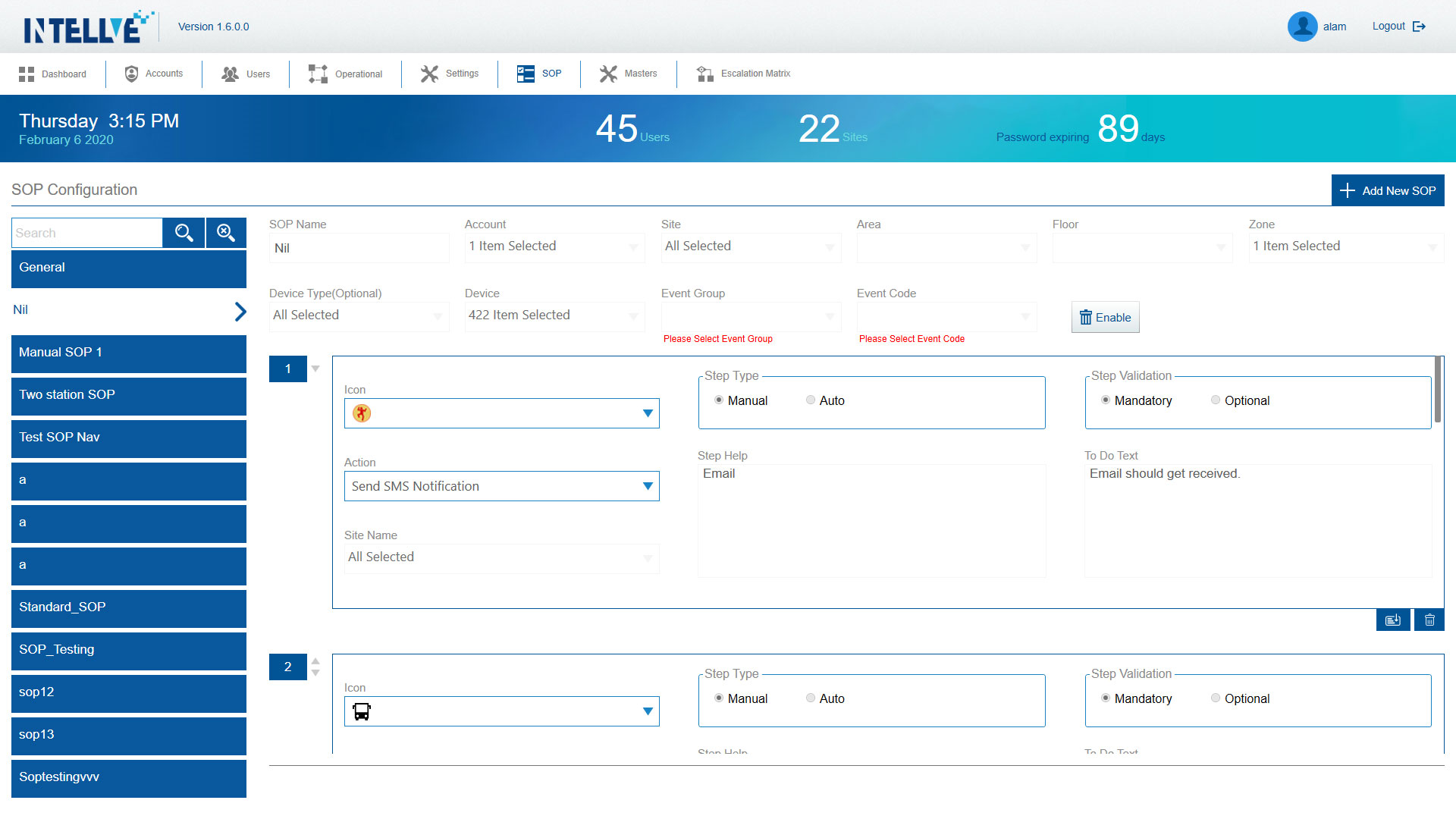
Entity-with-children. Master list on the left, detail on the right. Used for any configuration where a parent entity has a stable set of children being managed.
Where hierarchy is the primary constraint
Master data · categories, system modules
Type 02 · Table02
Table layout
Flat collections at scale. Sortable, filterable, virtualised. The bulk-edit and bulk-import workflows live here. Replaced the SQL workarounds the database team had been using.
Where scale is the primary constraint
Records · devices, sites, users, alert rules
Type 03 · Form + Map03
Form + Map layout
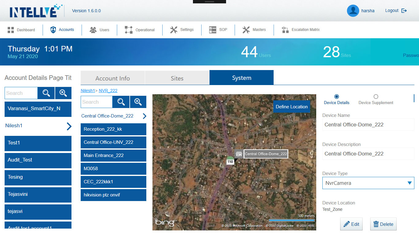
Geographic configuration. A form on the left, an interactive map on the right. Used wherever the configuration carries a location: sites, junctions, perimeters, response zones.
Where location is the primary constraint
Spatial · site setup, zones, junctions on a map
Every configuration screen the platform has ever needed fits 1 of 3 layouts. No fourth type was ever required.
200+
Pages
28–34
Deployments
8+
Years
Leadership signal
Every module owner eventually wanted a 4th layout for their special case. I said no, repeatedly, with the documented case for why the existing three would carry it. A constraint defended becomes productivity; a constraint abandoned becomes entropy.
Three types, 200+ screens
The Form-with-Map layout, 1 of 3 structural patterns: a form on the left, a live map on the right, for anything that carries a location. Part of 200+ screens built from just three templates.
Built to be reused.
The rebuild began by removing the thing that had failed. The rigid open-source UI library came out entirely, replaced with standard WPF components styled through a custom design system I built with my graphic designer. The system was deliberately practical rather than theoretical: what every button, field, table, and error state looked like, the spacing and alignment rules, and the three layout types. Enough to build any screen consistently, and no more.
The structure mattered more than the styling. Each configuration module was built as a self-contained folder inside one project, sharing a common component library and a single database layer. Adding a new module meant creating a folder and following the template, with no change to anything already built. The rules lived in documentation kept inside the project itself, the first thing a developer saw on opening it: the folder conventions, the three layouts and when to use each, the component library, and the standard for adding a module cleanly. This was the decision that made the system maintainable by people who were never in the room.
The developer was allocated part-time so the live project pipeline was never disturbed. The first working version, every existing module rebuilt from scratch, was delivered in 3 months. By 6 months it was mature and stable, and the company moved off the old tool entirely. The capabilities the broken version could never have carried, bulk operations at enterprise scale, came later, once real deployments proved the need.
Leadership signal
Embedding the documentation and the plug-in structure inside the project was a deliberate choice to make the system independent of any single person, including me. A rebuild that needs its author present to survive is not finished. One built to be maintained by people who were never in the room is.
Bulk operations at scale.
Bulk operations were not part of the original rebuild. They were added after the first 2 deployments proved the need. The Global Vipassana Pagoda had its data loaded straight into the database because the old tool could not cope, and Thane Police, the first client on the new TouchConfig, still needed a direct load for its opening bulk of cameras and sites. The pattern was clear after that: every enterprise deployment would arrive with thousands of records, and no one would enter them one form at a time. These were capabilities I defined and scoped, not features requested from a backlog.
01
Bulk Add
Delivery teams configuring 3,500+ branch locations or 50,000+ ATM sites cannot do this record by record through forms. A template-based Excel upload was built. The decision that made it genuinely usable at scale: when records failed, the system generated a file containing only the failed records with the reason for each failure. Not a count of failures. The actual records, downloadable, fixable, re-uploadable. Telling a user that 47 of 10,000 records failed without showing which 47 creates an operational dead end at enterprise scale.
02
Bulk Edit
Selection that showed at all times exactly how many records were selected, making the distinction between "all on this page" and "all 10,000 matching this filter" explicit and visible before any action was taken. The same pattern was later carried directly into MonitoringHub's Data Access Group management. A decision made for configuration management in 2016 was still solving the same problem in a different product in 2023.
When scale broke the filter.
As specific large clients grew past the scale the system was designed for, the cascading dropdown filter degraded. It stayed usable to around 35,000 records, turned sluggish through the hundreds of thousands, and at one client running 1.2 million records, timed across several runs, it froze the screen for 13 to 16 minutes on a single filter change. It never crashed; it simply stopped being usable. I did not optimise the dropdown. I replaced it. The drag-and-drop filter system I designed allowed users to construct their filter chain in any order they needed, at any hierarchical level, without the rigid linear dependency of the dropdown chain.
I added a Load button, deliberate friction, because automatic loading on a dataset of 1,000,000 records would have crashed the system. The user confirms when they are ready to fetch data. They are never surprised by a system hang. Then I worked with the development team on virtualised pagination: load 500 records, recycle memory as the user navigates forward, pre-fetch contextually when the user jumps to a specific page.
The team had not built memory-managed pagination before, so I worked through it with them iteratively, demonstrating the approach using examples from comparable systems, answering questions in whiteboarding sessions, reviewing the implementation at each step. Load time went from 13–16 minutes to near-instant. The system now handles 1,000,000+ records. The same logic was carried forward into MonitoringHub.
The filter against scale
13min
Load time before rebuild
0sec
Load time after
Four calls the rebuild turned on.
01
Kill it, not patch it
The rejected option was incremental improvement, which everyone preferred because the tool, broken, was at least present. I held that patching a broken foundation produces a better broken product, and that the architectural debt would compound with every module added. What it cost: rebuilding a core tool with a live project pipeline carried real short-term risk. What it bought: a foundation that has not needed replacing in 8 years.
02
Three layout types, never a fourth
The rejected option was a bespoke pattern for each module's special case, the easy thing to say yes to. The discipline was the fewest patterns covering the most cases, so no future screen ever needed architectural thinking. What it cost: saying no to module owners who wanted a custom layout, every time. What it bought: 200+ pages on 3 templates, unchanged for 8 years.
03
Documentation and structure inside the project
The rejected option was an external wiki and a monolithic build. I put the rules inside the project, the first thing a developer saw on opening it, and made each module a self-contained plug-in that could not break another. What it cost: more discipline upfront, on a live timeline. What it bought: a system one developer maintains today from documentation written years ago, with the author long gone.
04
Replace the filter, not tune it
At 1,000,000+ records the cascading dropdown had hit its architectural ceiling, not a tuning problem. The rejected option was optimising what was there. I replaced it with a drag-and-drop filter, a Load button, and memory-managed pagination. What it cost: deliberate friction, the user confirms before an expensive fetch, and a rebuild rather than a patch. What it bought: near-instant performance at any scale, and the same model carried into MonitoringHub.
The impact
Eight years. Zero structural change.
An architectural decision is only proven by how long it survives the conditions it could not predict. This one has lasted 8 years.
The numbers.
3
Layout types
The architectural decision itself. Documented, taught, and adhered to across the platform's full product line.
200 +
Configuration screens
New screens added consistently from the documented patterns, without architectural strain.
8+ yrs
Architecture endurance
No structural rebuild required as the product scaled: the proof that the structural read was correct.
13 min → 0
Filter load time
From 13–16 minute hangs at scale to near-instant. Architecture still handles 1,000,000+ records in production.
1M+
Records in production
The architecture still handles datasets past a million, the scale that broke the original tool, without a structural change.
28 +
Active deployments at departure
Each a live enterprise client with unique configuration datasets from hundreds to over 1,000,000 records.
The test of architectural authority
Duration under change, not approval at launch.
8 years is the proof. The system absorbed new modules, new product lines, new client deployments, and new team members without a structural rebuild. That is the only meaningful test of an architectural decision: whether it survives the conditions it could not have predicted. Today a single front-end developer maintains all 200+ configuration pages from the documentation alone, years after I left.
What changed structurally.
Before
After
Database team entering bulk configuration data directly in SQL to avoid the tool
Delivery team self-service through Excel bulk upload at any scale
Testing team visibly dreading any task that required opening TouchConfig
Tool invisible: works reliably, no incidents in 8+ years
Deployments bottlenecked by database team availability
Deployments self-sufficient: delivery teams operate independently
Crashes during normal use
STQC and RDSO certified. No crashes as a recurring issue since rebuild
No design system, no documentation, no plugin structure
Full design system, in-project documentation, plugin architecture. New modules added by developers independently from the template
It runs without me.
After the first 4 to 5 years of intensive involvement, the design system and project structure were mature enough that I stepped back from routine TouchConfig work entirely. New developers followed the in-project documentation and shipped consistent pages without involving me. When I left in March 2025, one front-end developer maintained all 200+ pages across all 28 to 34 client deployments using documentation I had written years earlier. That is not just a functioning product; it is design infrastructure.
Patterns the platform inherited.
TouchConfig set patterns the rest of the platform inherited. Its plug-in project architecture and in-project documentation became the model for every product built after, including the web rebuild of the Dashboard. Its virtualised pagination with predictive pre-fetching was carried directly into MonitoringHub, and the dual-panel selected and not-selected pattern from Bulk Edit became MonitoringHub's Data Access Group. It also embodied the principle I held throughout my tenure: configuration must never happen inside an operations tool, because an operator changing their own alert panel mid-incident is not a usability problem but a system failure.
Certified to government standard.
TouchConfig is STQC certified, the Standardisation Testing and Quality Certification of the Government of India, and RDSO certified for railway deployments. Certification at that level is independent proof the rebuilt tool met a reliability bar the original never could, the same tool experienced professionals had once refused to open.
Constraints
The limits I'd scope earlier.
What I would scope differently on the rebuild, and what the whole effort taught me.
Bulk Add belonged in the original scope.
The first 2 commercial deployments hit the exact bottleneck Bulk Add later solved: thousands of sites and devices, entered 1 form at a time. The need was foreseeable from the nature of enterprise configuration. It should have been in the six-month rebuild, not added once the pain had been proven.
I designed for the data that already existed.
The cascading filter was correct for the scale in front of us, around 35,000 records. But a platform gaining an enterprise client every quarter was always going to outgrow that. Designing for the visible scale instead of the coming one is what forced the filter rebuild later.
The commercial case should have been the opening argument.
I proposed the rebuild more than once on design and usability grounds, and it did not move. What closed it was commercial: shipping a tool in that state to paying clients put credibility at risk. That was just as true the first time. Leading with the business risk, not the craft, would have saved months.
The documentation should have been excellent in month one.
It became excellent by year 3. For the first 18 months, onboarding a new developer cost more than it needed to, because the guide was still catching up to the system. Documentation is a one-time cost; onboarding without it compounds every time. I underweighted it at launch.
Four things I carry forward.
Ask whether it should be fixed or replaced.
The most important diagnostic question is not how to fix something; it is whether it should be fixed or replaced. Incremental improvement on a broken foundation produces a better broken product. The forensic week before any proposal is what gave me the confidence to answer correctly: after it, the only viable path was a new one.
Architectural simplicity is harder than complexity.
Finding that 3 layout types covered every foreseeable configuration need required understanding the work at a structural level, not a surface one. The temptation in any redesign is to accommodate every edge case with a custom pattern. The discipline is the minimum number of patterns that cover the maximum number of cases. Three was correct.
Systems built to outlast their designer are better systems.
The plug-in architecture, the in-project documentation, the component library, the layout standard: none made the product more impressive to look at, all made it maintainable after I stopped looking at it. A product one developer can maintain from the documentation alone is the measure.
Making an uncomfortable case is a responsibility.
I proposed the rebuild more than once before approval, and each rejection meant returning to reframe and propose again. The responsibility to make a correct case does not end with the first refusal. If the diagnosis is right and the stakes are real, you keep making it until it lands.
How I lead
The decision only a leader makes.
Killing a working-but-broken tool rather than patching it, holding the line at 3 layouts against every request for a 4th, and building the thing to run without me are not TouchConfig stories. They are how I work, set out in full on the leadership page.