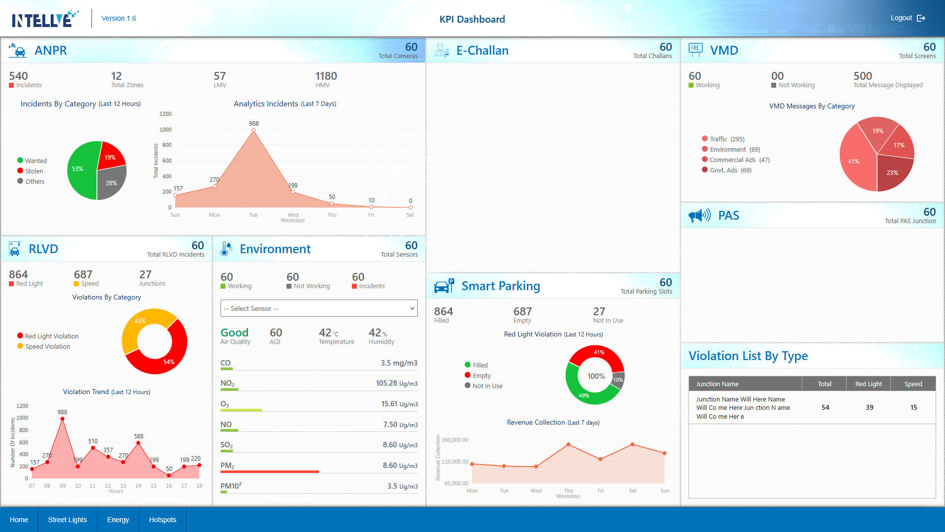
Eight charts inside operator software.
Observed
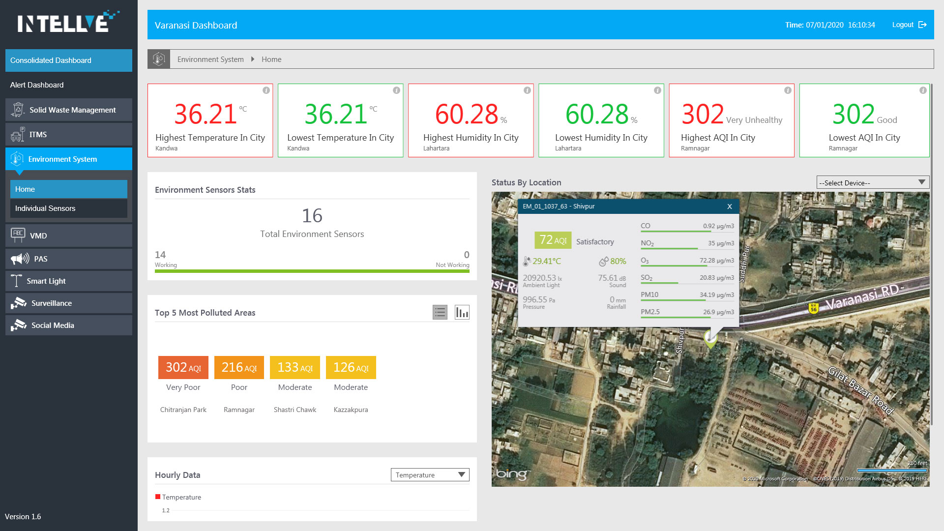
Executives and managers at multiple client organisations needed aggregate visibility: alert volumes, response times, site performance. The data existed. There was no way to access it without requesting reports manually from a database team or asking Intellve to generate spreadsheets. No self-service visibility existed anywhere in the product ecosystem.
Built
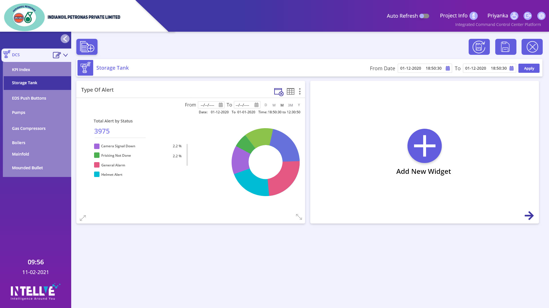
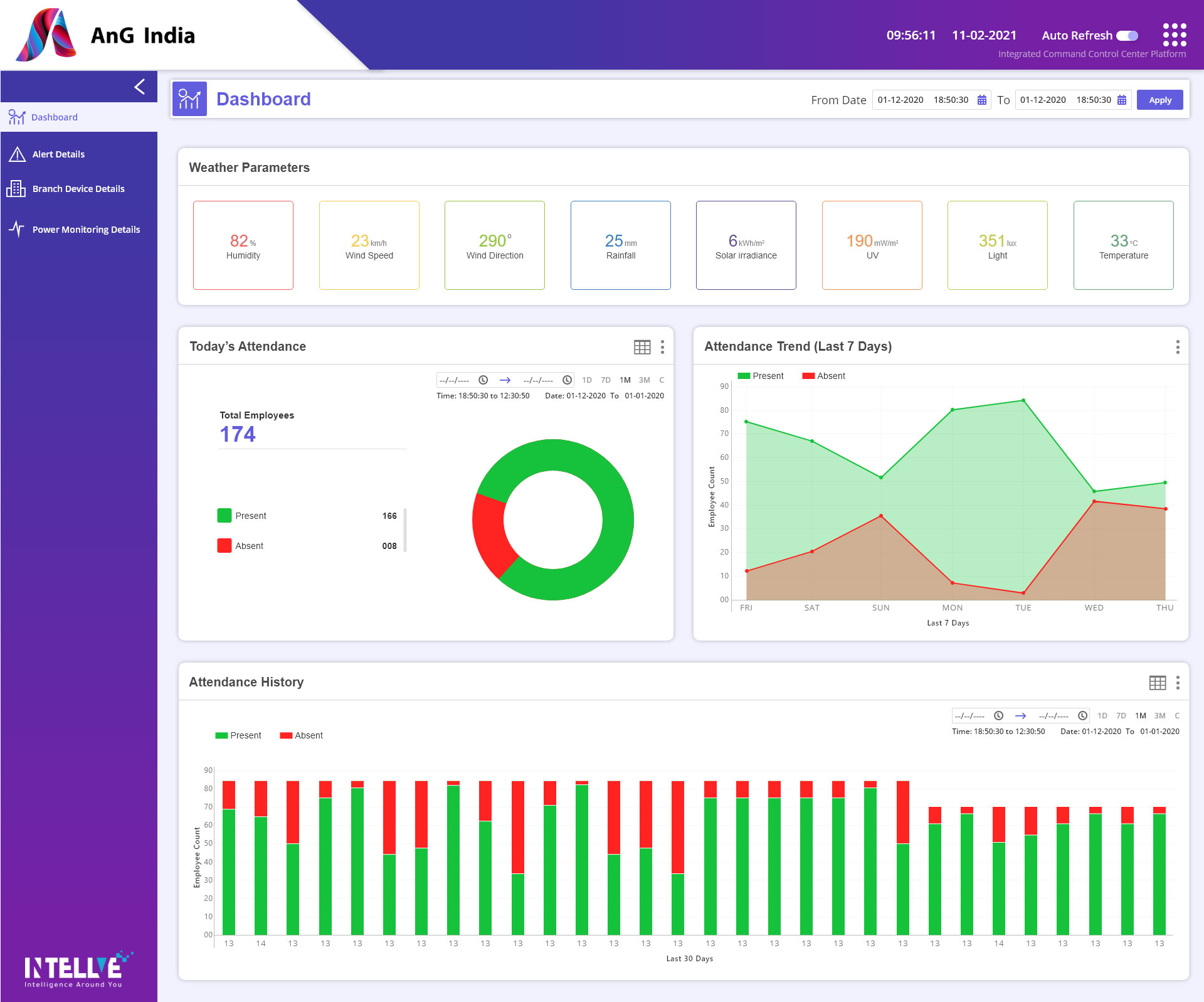
A dedicated analytics section inside the company's monitoring software: a few charts showing alert counts, severity distributions, and category breakdowns. This grew to seven to eight chart views as clients engaged and generated new ideas. View-only: no export, no table view, no download. Print-screen was the only way to share what was on screen.
Key decisions
The ceiling
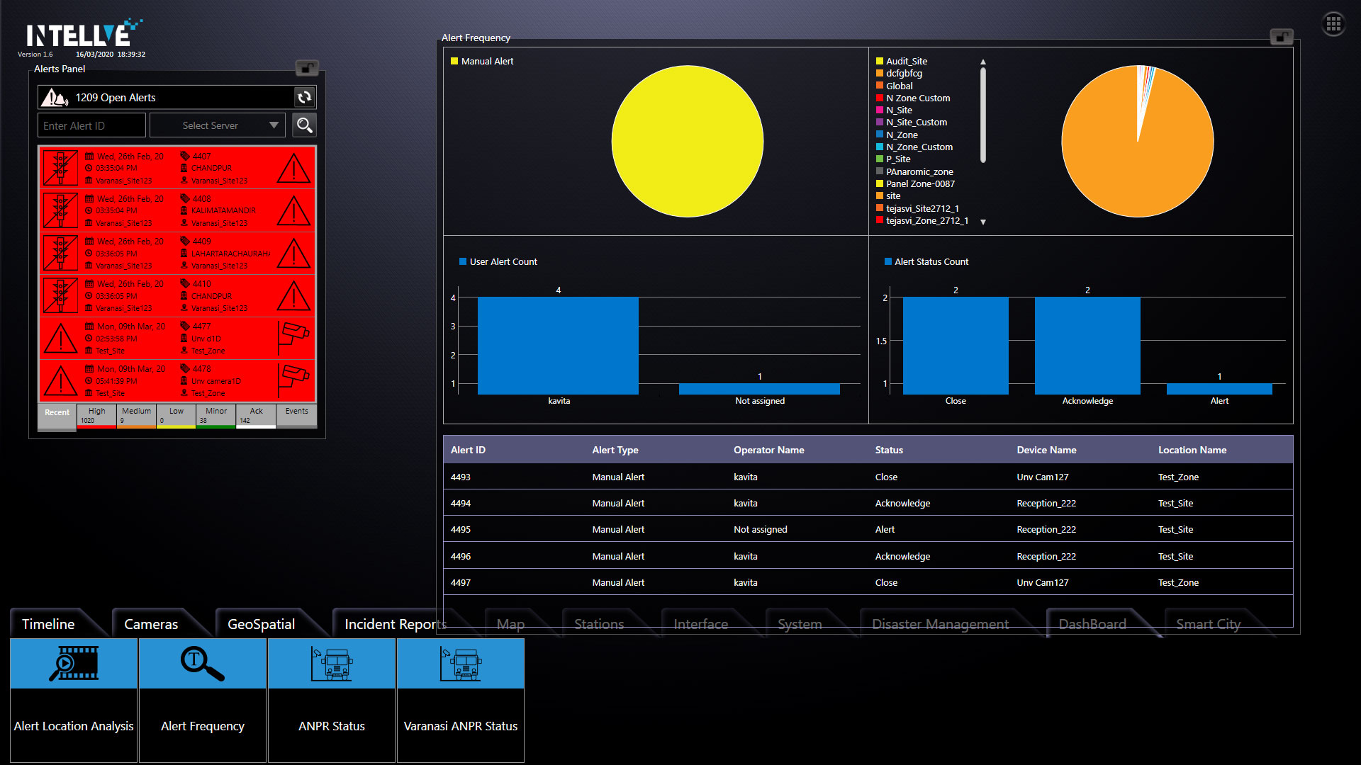
The first version lived inside TouchControl: a handful of charts for alert counts, severity, and category breakdowns. Enough to prove clients wanted it, but trapped inside software built for operators.